Most people hang bedroom posters at random heights, missing the 57 to 60 inch eye-level sweet spot that designers recommend for visual impact. Strategic placement, complementary framing in materials like black metal or warm wood, and a cohesive color palette work together to turn scattered prints into a gallery that anchors your room.
The difference between a generic bedroom and a well-designed sanctuary comes down to the choices you make about where and how you display your art.
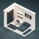
Anchor Your Bedroom With One Large Poster

Why settle for scattered wall décor when a single commanding poster can serve as your entire bedroom’s focal point? Select one large poster, positioned behind your bed or opposite seating, to establish immediate visual hierarchy and set your space’s mood from the moment you enter.
Choose an impactful image: a moody landscape or bold typography that resonates with your design vision. Your selection should align with your color palette, harmonizing with bedding and furniture tones for visual cohesion. The framing choice matters significantly; black frames deliver modern sophistication, while wood frames introduce warmth and approachability.
To create your gallery wall foundation, leave substantial negative space around this anchor piece. This breathing room prevents visual clutter and allows your poster’s power to register fully, establishing the confident foundation your bedroom requires.
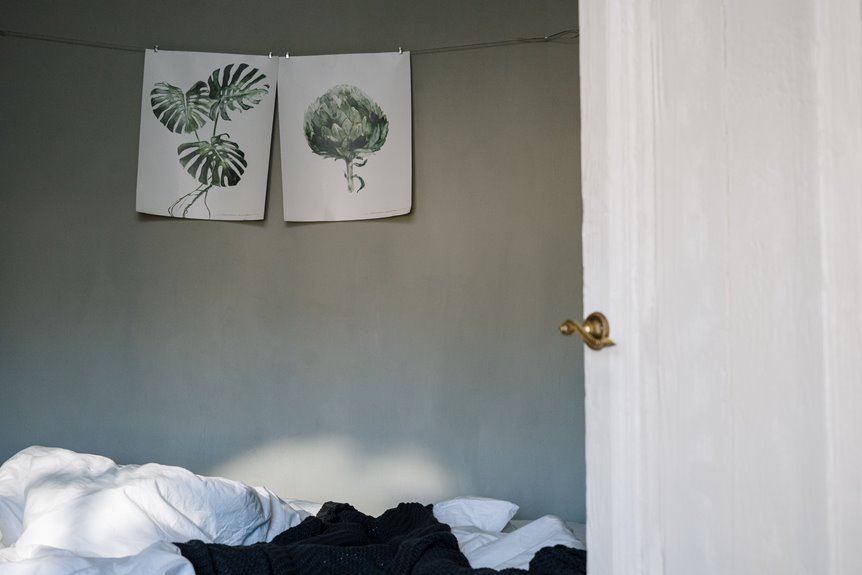
Select Calming Bedroom Posters in Muted Tones

Muted-tone posters in soft sage, dusty blue, warm taupe, and gentle gray create visual calm without demanding attention. When you select artwork featuring soft vistas, minimalist line drawings, or abstract compositions in these restrained palettes, you actively reinforce a restful environment rather than introduce visual competition. Pairing these pieces with coordinated bedding and textiles in complementary neutrals makes your bedroom a cohesive sanctuary that supports better sleep and relaxation.
Muted Tone Palette Selection
Creating a serene bedroom atmosphere hinges on selecting posters in muted tones: soft hues like taupe, sage, dusty blue, and warm gray that won’t overstimulate your visual space. These colors harmonize well with neutral bedding and wood furnishings, establishing a cohesive foundation for your wall posters.
| Color | Mood | Best With | Finish | Effect |
|---|---|---|---|---|
| Taupe | Grounded | Wood frames | Matte | Warmth |
| Sage | Calming | White frames | Soft | Balance |
| Dusty Blue | Serene | Natural wood | Matte | Depth |
| Warm Gray | Neutral | Black frames | Matte | Sophistication |
| Blush | Subtle | Minimalist frames | Matte | Contrast |
Pairing these muted tone palettes with soft landscapes and abstract art creates a serene gallery while maintaining visual restraint. Your wall posters will support restful sleep without dominating the room’s natural light.
Calming Visual Content Choices
Now that you’ve selected your muted color palette, the artwork itself becomes your next strategic decision. I recommend exploring soft scenery, minimalist line drawings, and abstract art featuring low-contrast palettes. These options reduce visual noise while maintaining the calming atmosphere you’re cultivating.
Soft scenery depicting natural scenes in muted tones creates tranquility without demanding attention. Minimalist line drawings offer simplicity and elegance through restrained composition. Abstract art in coordinated color schemes provides visual interest while preserving serenity.
Consider vintage-inspired prints or black-and-white photography as alternatives; they introduce nostalgic character without introducing jarring contrasts. The key is selecting imagery that complements rather than competes with your bedroom’s restful environment.
When these calming visual choices align with your muted tone foundation, you’ll establish a cohesive sanctuary designed for genuine relaxation.
Restful Bedroom Atmosphere Creation
How do you turn a bedroom into a genuine retreat rather than simply a room with new décor? Strategic poster placement creates visual calm that extends beyond aesthetics. Layering soft landscapes and vintage-inspired prints establishes the serene foundation you need.
Consider these placement strategies:
- Position calming posters above your headboard to anchor a restful focal zone
- Install small posters or gallery wall arrangements on reading chair walls using muted tones
- Select black-and-white photography or soft landscape imagery to minimize visual competition
Muted tones (warm grays, sage greens, and cream hues) reduce overstimulation while maintaining visual interest. In compact spaces, smaller posters prevent overwhelming walls without sacrificing impact. Vintage-inspired prints evoke nostalgic calm through their inherently subdued palettes. This cohesive approach turns walls into supportive design elements rather than attention-demanding features, fostering the tranquil space you’re looking for.
Build a Gallery Wall With 3–5 Posters Sharing a Common Theme

Why do gallery walls succeed where random poster arrangements fail? Intentional curation matters. I start with 3 to 5 posters sharing a cohesive theme, whether color palette, mood, or subject matter, that anchors the entire composition. Before committing to wall mounting, I lay posters on the floor to visualize poster layout and test spatial relationships. This planning on the floor prevents costly mistakes.
For balance, I anchor with one large centerpiece poster, then complement with mid-size prints arranged in horizontal and vertical orientations. This mix prevents monotony. I introduce texture through complementary elements like woven wall baskets or trailing pothos, which enhance visual interest without overcrowding the space. The result is a unified gallery wall that feels deliberate rather than haphazard.
Coordinate Poster Colors With Your Existing Bedroom Palette

Your poster selection succeeds or falters based on how deliberately it aligns with the colors already anchoring your space. Achieving palette harmony requires intentional coordination between posters and existing textiles.
Consider these strategies for a cohesive look:
- Echo dominant hues through color repetition. Select one or two posters that mirror a primary color from your bedding or curtains to unify the room visually.
- Deploy a neutral backdrop using white, cream, or gray walls. This allows bold poster colors to command attention without clashing against competing palettes.
- Match cool tones strategically. If your room features blues or greens, choose posters with analogous or complementary hues to maintain a serene atmosphere while ensuring textiles match your overall design intent.
This coordinating colors approach establishes visual cohesion throughout your bedroom environment.
Place Posters Above the Bed or in Reading Nooks

Where you position a poster determines whether it anchors your room or fades into visual noise. An oversized poster centered directly above your headboard creates immediate visual impact and establishes framing for your entire sleeping area. For reading nooks, I recommend flanking a comfortable chair with vertical posters on each side to guide the eye and define the space.
I balance multiple pieces by pairing one large anchor print with 2 to 3 smaller complementary works, maintaining rhythm without crowding. This approach works beautifully for gallery walls too. Match your frame finishes (brass, black, or white) to your bed’s hardware for cohesive harmony. In reading areas, choose calming visuals like soft landscapes or minimalist line art to support relaxation. These strategic placements keep posters functioning as purposeful design elements that ground your bedroom and reading spaces.
Mix Different Frame Styles to Add Visual Depth

How you coordinate frame styles determines whether a gallery wall feels intentional or haphazard. Mixing frames strategically creates a bedroom that functions as a curated personal space.
Consider these approaches:
- Vary frame widths from thin metallic borders to chunky wood frames, creating rhythm without chaos
- Match hardware finishes, such as brass, black, or white, to existing bedroom fixtures for visual cohesion
- Rotate individual pieces seasonally to refresh your focal poster’s supporting cast while maintaining theme consistency
Start with a central focal poster, then flank it with smaller frames to establish symmetry. This layering technique adds visual depth through contrasting sizes and shapes within a unified color family. The result is a mixed frames arrangement that feels both balanced and dynamic, anchoring your bedroom’s personality while inviting you into a space that reflects your aesthetic choices.
Use Negative Space and Lighting Around Your Posters

I’ve found that positioning posters at eye level, typically 57 to 60 inches from the floor, creates an immediate visual anchor that invites comfortable viewing. Pairing this strategic height with intentional negative space around each piece prevents the wall from feeling cramped or overwhelming.
Picture lights or wall washers deliver subtle illumination that draws attention without casting harsh shadows. Layered lighting (combining ambient, accent, and task sources) allows your posters to shift in appearance throughout the day, revealing different textures and tones.
Balancing bold prints against neutral walls or soft textiles prevents visual fatigue, keeping your bedroom calm rather than visually chaotic.
Strategic Spacing and Balance
The arrangement of posters demands deliberate consideration of negative space, that often-overlooked expanse of wall surrounding your prints. Spacing posters 2–3 inches apart creates visual breathing room, preventing your gallery wall from feeling cramped or overwhelming. To establish balance, consider these approaches:
- Position a large focal poster as your anchor, then flank it with smaller companion prints
- Mount pieces at eye level (57–60 inches from the floor) for natural sightlines throughout the room
- Leave substantial uncluttered wall area between groupings to enhance depth perception
This measured approach results in a thoughtfully arranged bedroom rather than a cluttered display. The interplay between poster and empty wall creates rhythm, allowing each piece breathing room while maintaining cohesion. Strategic spacing makes your gallery wall an intentional design choice rather than a decorative afterthought.
Lighting to Enhance Posters
While strategic spacing creates visual breathing room around your posters, thoughtful lighting positions those carefully arranged pieces as focal points that command attention throughout your bedroom. Install LED strip lights or wall washers at slight angles to eliminate glare on glossy finishes, creating soft, even illumination across your wall decor. Track or recessed lighting allows you to adjust focus on different poster clusters, shifting mood from calm to energizing as needed.
Position fixtures to highlight each piece without hotspots. Select warm color temperatures (2700K–3000K) to enhance cozy textures, or neutral tones (3500K–4000K) to emphasize modern graphics. This layered approach to lighting and visibility keeps your posters functioning as deliberate design elements rather than afterthoughts, building the cohesive bedroom space you want.
Framed or Unframed Bedroom Posters: Which Fits Your Space?

How do you decide whether framed or unframed posters will work best in your bedroom?
Your choice depends on your space’s needs and aesthetic goals. Framed posters create decor cohesion through matching frames while protecting artwork, whereas unframed wall posters offer a lighter, more casual aesthetic. Consider these factors:
Framed posters create cohesion and protect artwork, while unframed designs offer a lighter, more casual aesthetic for your space.
- Space constraints: In small spaces, opt for a few medium or small framed posters with clean frames to give each piece breathing room.
- Visual anchoring: Use one large poster or a carefully arranged 2 to 3 poster set as your focal point, whether framed or unframed, to anchor the wall effectively.
- Seasonal refresh: Framed canvases add structure and can be rotated seasonally to refresh your bedroom’s appearance without commitment.
Placement matters too. Position designs at eye level (57 to 60 inches from floor) for optimal viewing comfort and accessibility.