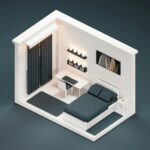
Pink bedrooms can feel sophisticated rather than juvenile when you approach the color strategically. The right shade makes all the difference. Soft pinks with dusky or grey undertones create contemporary elegance, while bright, youthful tones pull in the opposite direction.
Texture layering, neutral balancing, and metallic accents work together to give pink depth and dimension as a design foundation. Rather than relying on a single color, this approach creates visual interest and maturity in the space.
The central question becomes practical: which shade suits your bedroom best?
Choose Your Perfect Pink Shade for Every Space

How do you select a pink that’ll anchor your bedroom without overwhelming the space? Start by considering soft pink walls with dusky undertones and grey notes. These contemporary neutrals soothe without demanding attention. Blush pink offers versatility; it pairs seamlessly with various textures and existing décor. For impact, a feature wall using designer papers like Rousseau wallpaper by Emma J Shipley establishes visual interest while grounding your color scheme. A velvet headboard in coordinated pink tones adds sophistication and depth. Layer this with white or off-white linens for crisp contrast that enhances the overall aesthetic. Light pink shades work particularly well with mirrored accents and soft lighting, which reflect color and maintain the calm atmosphere you’re seeking throughout your personal retreat.
Layer Textures: Velvet, Faux Fur, and Pink Soft Furnishings
Once you’ve selected your pink palette and established a feature wall, layering textures creates visual depth and dimension. Combining materials builds richness while welcoming you into the space.
Consider these layering strategies:
- Velvet headboards and curtains provide substance and anchor the room; blackout linings add privacy and warmth
- Soft furnishings like cushions and throws introduce pattern. Flamingo velvet designs prevent a matchy appearance while increasing tactile interest
- Faux fur accents add luxury without overwhelming pink tones throughout the bedroom
- Double-layered window treatments control light while reinforcing your palette simultaneously
Design a Pink Feature Wall That Sets the Mood

A feature wall demands strategic choices in wallpaper and pattern. Rousseau’s Jungle design by Emma J Shipley layers pinks with blues and greens to establish sophisticated depth. Your selection anchors the entire room’s color psychology and emotional resonance.
Consider how the wall’s mood, whether calming or energizing, influences lighting placement and textile choices throughout the space. Your accent coordination succeeds when the feature wall harmonizes with bed linens, throw pillows, and accessories rather than competing with them. This creates visual cohesion that feels deliberate and thoughtfully composed.
Wallpaper & Pattern Selection
Why settle for plain walls when a strategically chosen feature wall can anchor your entire bedroom’s aesthetic? Thoughtful pattern selection changes a room’s character while establishing visual interest that aligns with contemporary design sensibilities.
Consider these approaches for your pink wallpaper selection:
- Nature-inspired patterns like Rousseau Jungle by Emma J Shipley incorporate pinks, blues, and greens, creating an outdoor-inspired atmosphere
- Dusky pink with grey undertones provides a contemporary neutral backdrop that complements diverse textures
- Layered soft furnishings (curtains, cushions, bedding) prevent visual clashes around your feature wall
- Velvet headboards coordinate harmoniously with patterned walls, adding tactile depth and sophistication
The key lies in selecting wallpapers that support tranquility rather than overwhelm. Your pattern choice anchors the room’s entire design language, making intentional curation necessary for achieving cohesive, adult-friendly spaces.
Color Psychology & Mood
The color you choose for your feature wall doesn’t merely decorate; it fundamentally shapes how you feel in the space, particularly in a bedroom where restful sleep matters. Dusky pink with grey undertones creates a contemporary neutral that promotes genuine relaxation. This sophisticated approach differs from bright pinks that overstimulate.
To establish your pink mood effectively, layer soft pastels through coordinating textiles and accent pieces. The feature wall anchors these elements while remaining calming rather than energizing. Strategic lighting and curtains become essential partners here. Blackout curtains control brightness during sleep, while sheer voile Roman blinds filter daylight gently, preserving your dusky pink’s soothing qualities without creating a cave-like atmosphere.
This balanced strategy turns your bedroom into a sanctuary where color psychology actively supports restorative sleep cycles.
Accent Coordination & Balance
Once you’ve committed to your dusky pink feature wall, the real design work begins: selecting complementary accents that amplify rather than compete with your chosen hue. Pairing your accent wall with thoughtfully curated elements creates cohesion throughout the room.
Consider these coordination strategies:
- Layer textures like velvet headboards and soft linens against the pink backdrop for visual depth
- Incorporate gold accents through lighting fixtures and hardware to enhance sophistication
- Position mirrors on both sides of your bed to reflect pastel tones and maximize natural light
- Balance with neutral bedding (crisp white sheets or hotel-style linens keep the space calming)
This approach allows your pink accents to work together harmoniously. When each element reinforces rather than fights your color scheme, you create an inviting sanctuary that feels both deliberate and restful.
Choose a Headboard That Frames Your Pink Walls

A velvet headboard in jewel tones (think emerald, sapphire, or deep plum) creates striking contrast against white linens while anchoring your pink feature wall as the room’s visual centerpiece. When you layer this upholstered frame with coordinating throw pillows in dusky rose or blush and drape a textured throw across the footboard, the headboard becomes the linchpin that ties together your entire soft furnishings palette.
The tactile quality of velvet fabric complements feature wallpaper patterns, whether geometric or botanical designs. This combination prevents your bedroom from feeling like disconnected elements and instead reads as a cohesively styled retreat. The sophistication of the velvet material works in concert with patterned walls to create a unified aesthetic that feels intentional from every angle.
Velvet Headboard Elegance
How do you anchor a pink bedroom without overwhelming the space? A velvet headboard in a complementary shade delivers the answer. This investment piece grounds your room while introducing tactile luxury that enhances the entire aesthetic.
Consider these strategic applications:
- Visual anchor: A dusty rose or mauve velvet headboard frames pink bedding and creates architectural interest
- Texture layering: Velvet’s richness pairs seamlessly with coordinated textiles like curtains and cushions, strengthening your pink palette
- Feature wall integration: Position your velvet headboard against a coordinated feature wallpaper to echo colors and textures throughout
- Sophistication factor: Luxurious textiles communicate refinement while maintaining comfort and livability
Velvet headboards coordinate exceptionally well with your existing design scheme. The fabric’s depth prevents your pink walls from feeling flat or one-dimensional, establishing a cohesive, designer-curated bedroom that feels intentional rather than monochromatic.
Feature Wall Coordination
Your velvet headboard’s luxurious foundation sets the stage for something equally powerful: a coordinated feature wall that amplifies rather than competes with your investment piece. I recommend selecting wallpaper that echoes your velvet headboard’s color intensity while introducing complementary textures, perhaps a subtle geometric pattern or soft matte finish that prevents visual monotony.
This feature wall acts as your bedroom’s anchor, grounding pink accents throughout the space. Layer matching soft furnishings like linen curtains and cotton throw pillows to create depth without oversaturation. Install wall sconces flanking the headboard; their warm light reflects off both surfaces, brightening your pastel palette cohesively.
The key lies in balance. Your velvet headboard and feature wall shouldn’t feel identical. Instead, they function as conversational partners. When textures complement rather than duplicate, you’ve achieved sophisticated coordination that ties your entire design together.
Balance Pink With Neutrals and Complementary Tones

When does pink shift from playful to sophisticated? Pairing pink with strategic neutrals creates an adult-friendly environment. Dusky pinks with grey undertones deliver contemporary calm, while creamy beiges and soft whites prevent visual overwhelm.
Consider these foundational pairing strategies:
- Combine dusty rose walls with charcoal grey upholstery and brass accessories
- Layer blush pink textiles against warm taupe neutrals for cohesion
- Use accessories like gold-framed mirrors to reflect pink tones without saturation
- Implement soft lighting through sheer voiles paired with blackout curtains for mood control
The key lies in restraint. Limit pink to 40% of your palette: walls, a velvet headboard, or coordinated bedding. Let neutrals anchor the scheme. This balanced approach creates a bedroom that feels intentional, sophisticated, and genuinely restful rather than overwhelming.
Control Light and Privacy Without Sacrificing Style

Managing light and privacy in a pink bedroom works best when you select window treatments that balance functionality with your room’s aesthetic. Blackout-lined velvet curtains paired with Roman blinds accomplish this effectively.
Velvet curtains in blush, mauve, or dusty rose tones with blackout linings eliminate glare while maintaining your room’s luxe palette. Roman blinds in voile or blackout fabric offer daytime privacy without adding visual bulk. Layering sheer voile Roman blinds beneath heavier curtains creates soft light diffusion during daylight hours, while blackout options close completely at night. This approach gives you complete control over your sleep environment throughout the day.
Blackout Lined Velvet Curtains
Three design elements converge when you layer velvet curtains with blackout lining: light control, privacy, and aesthetic refinement. This combination addresses the core challenges of bedroom design while improving your space’s visual appeal.
When you select velvet curtains paired with blackout lining, you’re investing in functionality that doesn’t compromise on style. The fabric’s inherent luxury creates an inviting atmosphere, while the lining performs critical work behind the scenes.
What blackout-lined velvet curtains deliver:
- Complete darkness for uninterrupted sleep cycles
- Enhanced privacy during day and night hours
- Thermal insulation that reduces energy costs
- Sophisticated texture that complements dusky pink tones
Measure and fit these curtains with precision. This ensures full coverage across your window frame, whether you’re working with wooden or uPVC materials. The result is a bedroom that feels both professionally designed and genuinely restful.
Roman Blinds Light Filtering
While blackout-lined velvet curtains deliver complete darkness for sleep, Roman blinds offer a more nuanced approach to light management that doesn’t require total window coverage. Voile Roman blinds, like Echo White Voile, provide daytime light filtering while maintaining privacy; a balance many homeowners seek for pink bedrooms. The soft, diffused light these blinds create complements blush and mauve tones well. When you pair Roman blinds with blackout lining, you gain flexibility: filter gentle morning light during relaxation or seal out glare for undisturbed sleep. Off-white Roman blinds work particularly well against wooden or uPVC frames, grounding pink accents without competing for visual attention. This layered approach to light control makes your pink bedroom a restful space.
Add Mirrors to Reflect Your Pink Color Palette

Mirrors serve a dual purpose in pink bedrooms: they amplify light and reinforce your color story without adding visual clutter. Strategic placement affects how your pink palette reads throughout the space.
Mirrors amplify light and reinforce your pink color story, creating visual impact without adding clutter to your space.
Consider these mirror placement strategies:
- Fitted wardrobes with full-length mirrors bounce light around the room, enhancing brightness and perceived spaciousness
- Positioning mirrors on both sides of your bed reflects pastel shades and feature walls for cohesive color effect
- Gold, rose gold, and brass frames tie metallic accents into your pink-focused decor, adding sophistication
- Balanced placement prevents glare while maintaining the tranquil ambiance you’re cultivating
Velvet headboards paired with coordinated textiles and reflected light create depth and luxury. Your mirror choices anchor the bedroom’s aesthetic while functioning as practical design elements that strengthen your pink palette’s visual impact.
Balance Pink Walls With Natural Greenery

How can you prevent pink bedrooms from feeling one-dimensional or overly sweet? Introduce greenery strategically throughout your space. Potted plants positioned on nightstands or shelves create visual balance against pink accent walls, while trailing vines soften architectural edges. Natural wood elements, whether your bed frame or floating shelves, ground the palette and prevent excessive softness.
Consider pairing your velvet headboard with eucalyptus or monstera plants nearby. The contrast between luxe textures and organic foliage creates sophisticated depth. Greenery also improves air quality, contributing to that restful sleep environment you’re cultivating. Layer these natural elements with your existing pink accents and metallic details for cohesion.
This approach results in a bedroom that feels intentional rather than one-note.
Finish With Brass, Rose Gold, or Antique Hardware
The hardware you select—from curtain poles to mirror frames to drawer pulls—anchors your pink bedroom’s overall aesthetic, and choosing warm metallics like brass, rose gold, or antique finishes will enhance rather than compete with your blush-toned palette.
Consider these hardware finishes for cohesion:
- Brass hardware on lighting fixtures and curtain poles echoes velvet headboard details
- Rose gold accents in drawer pulls and cabinet knobs complement blush tones with understated warmth
- Antique brass on mirrors reflects pink tones while adding vintage-inspired depth
- Coordinated metals across lamps, frames, and furniture prevent visual clashing
Subtle metallic hardware adds sophistication without overpowering your calming, adult-friendly space. Match hardware finishes throughout the room. This consistency creates intentional design rather than scattered choices. The result is a bedroom that feels carefully planned and serene.
Layer Ambient, Task, and Accent Lighting for Warmth

Why settle for a single light source when you can build depth and warmth through strategic layering?
Combine ambient lighting (overhead fixtures or wall sconces) with task lighting near reading areas and accent pieces like crystal bedside lamps. This three-part approach creates visual interest in your pink bedroom. When layering curtains with pink fabrics and velvet textures, lighting becomes architectural; it plays across fabric surfaces, creating dimension without glare.
Gold-toned fixtures complement warm undertones in your palette. Install dimmers to control intensity throughout the day. Velvet curtains diffuse harsh light while maintaining your room’s luxe aesthetic. The interplay between soft furnishings, metallic accents, and varied lighting sources establishes visual richness. Strategic placement ensures accessibility and functionality while reinforcing the cohesive design you’ve cultivated through your previous hardware and window treatment selections.