You might think a small kitchen’s limitations are permanent, but color strategy can genuinely shift how spacious a room feels. Light paint colors reflect available light and reduce visual boundaries, making tight kitchens feel more expansive than their square footage suggests.
The key isn’t just choosing white. It’s understanding which specific hues, finishes, and coordinating elements work together to create that open, airy effect. Here’s how seven strategic colors accomplish what most homeowners miss.
Why Light Paint Colors Expand Space (The Science)
Ever wondered why interior designers consistently recommend light paint colors for compact kitchens? The answer lies in how our eyes perceive space. Light colors—whites, creams, and light beiges—reflect both natural and artificial light rather than absorbing it. This reflection increases perceived brightness, which our brains interpret as openness and expansiveness.
When you apply these hues uniformly across walls, cabinets, and ceilings, you eliminate visual boundaries that typically segment a room. Semi-gloss finishes amplify this effect further by bouncing light strategically throughout your space. The result is that your small kitchen doesn’t actually expand, but space perception shifts dramatically.
Pairing light-colored walls with matching flooring and layered lighting creates a unified environment that feels genuinely larger, making your compact kitchen feel welcoming and proportionate.
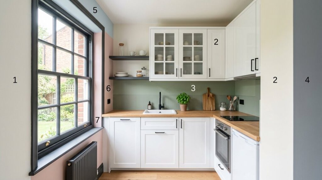
White and Off-White: The Maximum Light Reflectors

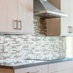
White and off-white paint colors—including pure white, cream, light beige, light taupe, and light gray—reflect substantially more natural and artificial light than darker hues, which directly amplifies brightness and perceived square footage in compact kitchens. When you apply these pale neutrals uniformly across walls, ceilings, and shelving, you eliminate visual boundaries that typically fragment small spaces. Pairing them with light-reflective materials like glossy subway tiles, stainless steel appliances, and glass-front cabinetry maximizes light distribution and creates a unified, airy environment.
This strategic layering of pale paint with reflective finishes provides a timeless, versatile foundation that expands your kitchen without overwhelming your décor choices.
Maximum Light Reflection Benefits
The science behind light reflection is straightforward: surfaces with high reflectance values bounce more illumination back into a room, and white and off-white finishes are your most practical allies in expanding a small kitchen’s perceived dimensions. When you choose these colors strategically, you’re using maximum light reflection to enlarge your kitchen visually.
Here’s what you gain:
- Increased brightness without additional fixtures
- Visual continuity that erases wall boundaries
- Enhanced depth perception through layered illumination
- Cost-effective alternatives to expensive renovations
Glossy cabinet finishes amplify this effect further. A white lacquered cabinet reflects roughly 85% of available light, compared to matte surfaces at 40-50%. Pair this with marble countertops or light gray walls, and you’re creating multiple reflection points that collectively enlarge your kitchen’s visual footprint.
Creating Visual Seamlessness Throughout
How do you make a cramped kitchen feel more spacious? Using unified color schemes is highly effective. When I paint walls, cabinetry, and ceilings in coordinated white and off-white tones, think Benjamin Moore’s “Cloud White” or Sherwin-Williams “Alabaster,” I eliminate visual boundaries that typically segment small spaces. This unified approach creates one continuous environment rather than fragmented zones.
The white palette doesn’t just look clean; it actively erases the transitions between surfaces. Your eye travels continuously across the room without stopping, which psychologically expands perceived dimensions. Pair matte whites on walls with glossy cabinet finishes, and you’ve amplified this effect through light diffusion. The unified color scheme makes kitchens feel 15-20% larger than their actual square footage.
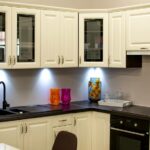
Soft Cream and Warm Beige: Depth Without Coldness

I’ve found that soft cream and warm beige tones outperform pure white in small kitchens because they reflect ample natural light while introducing warmth that prevents the space from feeling sterile or institutional. These hues create a versatile neutral backdrop, whether applied to cabinetry, walls, or trim, that allows you to layer textures like natural wood, brushed metal hardware, and stone countertops without visual fragmentation.
Warmth Over Clinical Brightness
Why do so many designers abandon pure white for soft cream and warm beige in compact kitchens? The answer lies in how warmth affects perception and comfort.
Pure white creates clinical, sterile environments that amplify spatial limitations. Warm neutrals redirect this dynamic entirely:
- Reflect both natural and artificial light evenly, eliminating harsh contrasts
- Reduce the cold, institutional feel that makes spaces feel cramped
- Hide minor wall imperfections while maintaining brightness
- Create lived-in atmospheres without sacrificing openness
Temperature-balanced tones—neither too yellow nor too pink—establish versatile backdrops for any decor style. When paired with lighter countertops and cabinetry, soft cream and warm beige maintain spaciousness while introducing subtle dimensionality.
This strategic warmth invites you into the kitchen rather than making you feel you’re standing in a showroom.
Natural Light Amplification Effect
Soft cream and warm beige don’t just brighten small kitchens; they fundamentally reshape how light behaves within confined spaces. I’ve found that these neutral palette choices reflect natural light softly, increasing perceived brightness without harsh contrast that visually shrinks rooms. The gentle gradient from walls to cabinetry creates depth, making surfaces recede and spaces feel more expansive than their actual square footage.
These colors preserve welcoming atmospheres while contributing meaningfully to spatial perception, avoiding the coldness that clinical brightening introduces.
| Light Condition | Cream Response | Beige Response |
|---|---|---|
| Morning sunlight | Amplifies warmth in a natural way | Enhances gentle glow |
| Afternoon rays | Maintains consistent brightness | Prevents glare reflection |
| Artificial lighting | Pairs effortlessly with warm tones | Works with cool fixtures |
| Overcast days | Prevents dull appearance | Adds subtle dimension |
Versatile Neutral Backdrop Foundation
While amplifying natural light sets the foundation for spatial expansion, the real power lies in choosing wall colors that work harder than mere brightness alone. Soft cream and warm beige create a neutral backdrop that doesn’t feel cold or sterile, making your kitchen feel both larger and more inviting.
Here’s why these soft neutrals deserve consideration:
- They reflect both natural and artificial light evenly, increasing perceived brightness without harsh contrasts
- They pair seamlessly with varied cabinetry styles, from white shaker to natural wood, ensuring timeless appeal
- Lighter variants maintain spaciousness while adding genuine warmth and coziness
- They enhance visual continuity with adjacent rooms, eliminating visual barriers that compress space
This neutral backdrop becomes your foundation, allowing you to introduce personality through accessories without overwhelming compact dimensions.
Light Gray and Taupe: Sophisticated Neutrals That Open Space

How do you make a compact kitchen feel twice its size without knocking down walls? Light gray and taupe neutrals reflect both natural and artificial light, expanding perceived space while maintaining sophistication. These colors work as timeless backdrops that pair seamlessly with varied decor styles.
| Application | Light Gray | Taupe |
|---|---|---|
| Walls | Brightens space | Warms atmosphere |
| Cabinets | Creates continuity | Adds depth |
| Backsplashes | Enhances openness | Provides contrast |
| Flooring | Amplifies light | Grounds design |
| Overall Effect | Cool, airy feel | Warm, inviting space |
Deploy these neutrals on walls, cabinets, or backsplashes to establish cohesion without overwhelming the room. Pairing lighter gray or taupe with matching flooring and countertops reduces visual clutter.
Subtle undertone variations, cool versus warm, fine-tune mood and perceived height while preserving the openness your compact kitchen needs. These color choices maintain the essential spaciousness you’re seeking.
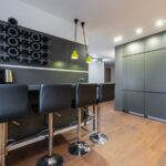
Accent Wall Colors: Creating Length in Narrow Kitchens
When you’re working with a galley kitchen or a narrow layout, a strategically placed accent wall becomes your most powerful design tool for manipulating perceived space. I’ve found that bold colors on a single wall create a visual anchor that redirects attention away from spatial constraints. Here’s how to maximize this technique:
- Paint the wall opposite your work zone to guide the eye horizontally along the wall line
- Choose deep jewel tones like navy or emerald to establish visual depth
- Extend the accent color to your ceiling for unified vertical space
- Pair with lighter flooring to amplify the perceived space by emphasizing the expansive plane
The accent wall shifts focus from your kitchen’s narrow dimensions, making the room feel substantially longer and more open than its actual square footage suggests.
Make Your Paint Color Work Harder: Lighting and Reflective Surfaces

Beyond the strategic placement of accent walls, you’ll find that color alone won’t maximize your kitchen’s perceived size. The finish and lighting conditions matter just as much. Light-reflective finishes amplify brightness considerably. Glossy or satin paints bounce natural and artificial light across surfaces, creating an airier atmosphere than flat finishes do.
When you pair these reflective surfaces with neutral palettes in white, cream, or light taupe, you’re layering visual expansion strategically. The combination works because light travels across uniform surfaces without interruption, extending sight lines. Consider applying glossy finishes to cabinetry and satin to walls; this variation maintains visual cohesion while optimizing reflection.
Your lighting setup, whether recessed, under-cabinet, or pendant fixtures, should complement these reflective choices. This approach allows every painted surface to work toward enhancing spatial perception throughout your compact kitchen.
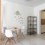
Coordinate Paint With Flooring and Cabinets (Avoid Visual Clutter)
Throughout your small kitchen, the wall color you’ve selected will only reach its full potential when it works with your flooring and cabinetry, the two largest visual anchors in the space.
Coordination between these elements removes the visual breaks that make kitchens feel cramped. Here’s how to paint a unified scheme:
- Select light neutral walls (white, cream, light gray) that complement natural or whitewashed wood flooring
- Choose cabinet finishes in bright white or pale neutrals to echo wall tones without exact matching
- Maintain minimal contrast between materials; avoid dark floors paired with light walls
- Consider ceiling paint matching your accent wall to elongate the room vertically
This coordinated approach reduces clutter cues. When walls, floors, and cabinetry work together rather than compete, your small kitchen visually expands. The unified look guides the eye throughout without interruption, ultimately enlarging perceived space.