When you’re planning a mid-century kitchen renovation, the color foundation you choose will determine whether your space feels authentically retro or accidentally dated. I’ve found that designers consistently recommend starting with warm neutrals—cream, soft gray, or taupe—as your backdrop, then layering in era-defining accents like ochre or teal.
But here’s where most homeowners stumble: knowing which colors to pair together without creating visual chaos. Let me show you how.
Start With Warm Neutrals

Why do most successful mid-century kitchens begin with a neutral foundation? I’ve found that warm neutrals—cream, soft gray, and taupe—create the perfect backdrop for bold mid-century accents without overwhelming the space. These baseline colors reflect light efficiently, making kitchens feel larger and cleaner while allowing furniture silhouettes and hardware to stand out.
Pairing warm neutrals with natural materials like oak and walnut reinforces the earthy, organic aesthetic central to mid-century design. Off-white walls and countertops act as a canvas for graphic shapes and cabinetry patterns, preventing visual clashes. When you establish this neutral base, you’re not just painting walls; you’re creating an environment where each design element belongs alongside others.
This strategic foundation lets your kitchen communicate with clarity and purpose.
Bold Accent Colors That Define the Era

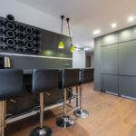
Once you’ve established your neutral foundation, bold accent colors bring mid-century authenticity to your kitchen design. Reds, teals, and pale pinks create the characteristic mid-century color palette when balanced against warm woods and creams. Bright red accents work well as visual anchors, particularly on cabinet fronts or appliance trim, while teal or blue-green tones pair naturally with wood cabinetry for sophisticated contrast.
These bold accent colors maintain functional harmony alongside clean lines and graphic shapes that define the era. Glass, lucite, and metal hardware amplify these choices without compromising the streamlined aesthetic. Every element, from color to hardware, communicates mid-century design authenticity while establishing visual rhythm that connects your kitchen’s form and function.
Mid-Century Color Palettes for Wood and Metal

How do you balance warm wood tones with cool metallics while maintaining the era’s signature visual harmony? The answer lies in strategic material pairing. Natural woods like walnut and teak serve as your foundation, grounding mid-century color palettes with warmth. Against these rich surfaces, introduce brushed brass or chrome accents; glass and lucite details amplify this contrast without competing.
Incorporate neutrals like Ashwood OC-47 to mediate between warm wood and cool metal. This layering creates visual interest while preserving harmony. The key involves restraint; you’re not mixing materials indiscriminately but orchestrating them. When wood and metal work together intentionally, they establish the balanced aesthetic that defines mid-century design, with neither dominating, yet both strengthening the composition’s overall sophistication and appeal.
Contrast in Mid-Century Color Schemes

What makes a mid-century kitchen work well is the deliberate interplay between bold accent colors and grounding neutrals. Successful mid-century color palettes rely on this foundational contrast. Warm ochres and earthy browns anchor the space while vibrant reds and gray-blues create visual tension that prevents the design from feeling flat.
Neutrals like Ashwood OC-47 and Woodstock Tan HC-20 provide breathing room, allowing bold accents to command attention without overwhelming the kitchen. Your backsplash becomes the ideal vehicle for this contrast, featuring geometric shapes that echo your color strategy. When you pair these elements thoughtfully, striking accent colors against soft off-whites and natural woods create a mid-century aesthetic that feels both intentional and lived-in.
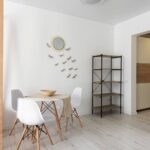
Balance Retro Flair Without Feeling Dated

The trick to keeping mid-century style fresh rather than frozen in time lies in pairing your boldest color choices with restraint elsewhere. I recommend anchoring spaces with warm wood cabinetry and cream or gray walls, which provide visual breathing room for accent colors like teal or red. This approach prevents the palette from feeling overwrought.
Natural light amplifies balance; it softens bold mid-century color choices and highlights warm wood tones without requiring additional decoration. Position seating near windows so daylight can dance across surfaces.
Reserve graphic patterns for backsplashes or small focal points rather than dominating entire rooms. Keep countertops and hardware consistent in finish; matte black or brushed brass work well. This restraint keeps your retro aesthetic looking deliberate and contemporary, not nostalgic.
Test Your Palette Before Renovation

Before you commit to painting walls or ordering cabinetry, shouldn’t you verify that your chosen mid-century palette actually works in your specific kitchen?
I recommend testing Benjamin Moore’s sampling options before renovation. Display chips, brush-on samples, and peel-and-stick samples let you observe how warm ochres, earthy browns, and bold accents perform under your kitchen’s lighting conditions.
| Sample Type | Best For | Application | Cost | Timeframe |
|---|---|---|---|---|
| Display Chips | Quick comparison | Hold against surfaces | $3-5 each | Immediate |
| Brush-On Samples | Realistic visualization | Paint 2×3 foot sections | $8-12 each | 24 hours |
| Peel-and-Stick | Risk-free testing | Apply temporarily | $10-15 each | Removable |
| Neutral Foundations | Base assessment | Ashwood OC-47, Wales Gray 1585 | Varies | Ongoing |
| Bold Accents | Accent evaluation | Reds, teal, gray-blues | Varies | Strategic |
This methodical approach confirms your mid-century color palettes work well with existing wood, glass, and geometric furnishings before commitment.
Apply Colors to Cabinets, Walls, and Backsplashes

I’ll guide you through selecting cabinet colors and coordinating your walls and backsplash to achieve an authentic mid-century aesthetic. Your cabinets form the foundation of this palette. You can choose natural wood tones that showcase grain detail or opt for painted finishes in warm ochres and soft off-whites, which designers like those at Atomic Ranch magazine frequently pair with slim shaker or flat-front styles featuring glass or lucite inserts.
Neutral cream or gray walls provide a understated backdrop that allows your cabinetry to stand out. A bold backsplash featuring geometric patterns in red or teal-blue serves as the main visual element that brings the color scheme together through harmony and contrast.
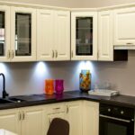
Cabinet Color Selection
How do you anchor a mid-century kitchen without sacrificing the airiness that defines the era? Your cabinet selection sets the foundation for the entire space, so I’d recommend considering these mid-century colors and finishes:
- Natural wood finishes like walnut or teak provide warmth while maintaining authenticity
- Painted warm accent tones, think muted yellows, teals, or soft reds, introduce personality without overwhelming
- Neutral base cabinets in soft whites or creams keep the kitchen feeling open and bright
- Minimal hardware in glass, lucite, or brushed metal reinforces the streamlined aesthetic
Your cabinet finishes should balance bold accents with understated elegance. When you choose warm ochres or earthy browns as primary tones, you’re grounding the space while preserving that characteristic mid-century lightness.
Clean lines and restrained hardware complete this balanced approach.
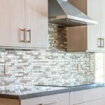
Wall and Backsplash Coordination
Once your cabinets establish the foundational palette, walls and backsplashes become the secondary layers that either amplify or soften that initial statement. I recommend pairing neutral wall coordination with geometric backsplash patterns to maintain mid-century authenticity. Cream or gray walls create breathing room, allowing bold backsplash patterns, think hexagons or starburst designs, to command visual interest without overwhelming the space.
When selecting backsplash patterns, consider how natural light interacts with glossy tile finishes; this interaction makes colors appear more dynamic. Metal hardware and glass elements frame these surfaces beautifully, keeping your mid-century palette consistent across the room. If you’re drawn to accent walls, warm ochres or gray-blues work effectively behind cabinetry, grounding the kitchen while earthy materials like wood connect all elements with intention.