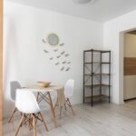
If trends were weather, your kitchen would be a perpetual spring, and that’s precisely why neutral design matters. I’m guiding you through spaces that prioritize function over fleeting aesthetics, where warm whites, greiges, and natural wood create lasting appeal rather than dated charm.
You’ll discover how brass hardware, veined marble, and intentional layering work together, but the real value happens when you understand which design choices actually serve your cooking habits. Here’s what separates elegant restraint from boring emptiness.
Design for Your Lifestyle, Not Trends

Rather than chasing what’s currently fashionable, a bespoke kitchen should prioritize how you’ll actually live in and use the space. I’ve found that neutral tones—warm whites, soft grays, and natural wood—create a timeless kitchen foundation that accommodates your evolving needs rather than dictating them.
Consider your daily routines first. Do you entertain frequently? Your layout should feature an accessible island with seating. Do you bake regularly? A dedicated station with proper storage matters more than trendy finishes.
The design process centers on client-driven decisions that balance bold elements with complementary materials like brass hardware or limewash walls. This approach supports both everyday cooking tasks and hosting aspirations, aging gracefully alongside your lifestyle rather than falling dated within seasons.
Start With Lighting to Choose Your Neutral Kitchen Palette

Why does the same warm white paint look golden in one kitchen and grayish in another? Lighting conditions determine everything. I’ll start by assessing your room’s daylight exposure and artificial light temperature before selecting any neutral palette.
Natural light shifts throughout the day. North-facing windows deliver cool, consistent illumination, while south-facing spaces grow warm and intense. Artificial lighting matters equally. Cool LED bulbs (5000K) will enhance cool grays, whereas warm white bulbs (2700K) complement creamy beiges.
I evaluate how marble counters, wood cabinetry, and quartz surfaces read under your specific lighting. The Four Layer Formula covers ambient, task, accent, and decorative lighting to keep your neutral palette looking beautiful across all conditions. This systematic approach prevents costly repaints and guarantees long-term aesthetic harmony throughout your kitchen.
Build Depth With Warm Earth Tones and Texture

How do you add visual richness to a neutral kitchen? I’ve found that layering warm earth tones with strategic texture creates the depth you’re seeking. Slatted cabinetry adds abundant dimension to your space, while headboard-style cabinet designs break monotony and enhance visual interest across walls.
Pairing warm brown-green cabinets with creamy white appliances and farmhouse sinks establishes sophisticated contrast without abandoning neutrality. Olive wood accents amplify natural warmth alongside creamy neutrals, grounding your neutral kitchen in authenticity.
Texture in cabinetry emphasizes color depth, making the space feel richer and more tactile than flat finishes allow. These layered materials work together to create a cohesive, inviting environment rooted in natural materials and understated elegance.
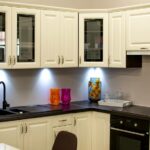
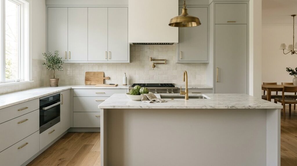
Greige: The Neutral Kitchen Color That Works Everywhere

I’ve found that greige delivers a sophisticated neutral base by blending grey’s coolness with beige’s warmth, which allows you to anchor your kitchen design without committing to a single temperature. You can pair greige cabinetry with marble countertops and warm oak flooring, or conversely, combine it with cool-toned quartz and brushed steel fixtures. The color adapts to your material choices rather than fighting against them.
When you introduce statement hardware in brass or matte black alongside textured cabinet doors, greige recedes gracefully, letting these elements command attention while maintaining an understated elegance throughout your space.
Greige’s Versatile Color Balance
When you’re searching for a kitchen color that bridges warm and cool tones without committing to either extreme, greige delivers precisely that balance. I find this neutral works because it accommodates both warm woods and cool marble surfaces effortlessly. The color doesn’t demand a specific aesthetic; it supports modern minimalism just as effectively as farmhouse charm, depending on your finish selections and textures.
What makes greige particularly valuable is its compatibility with statement hardware. Brass or brass-finish fixtures introduce timeless contrast against greige cabinetry, creating visual interest without overwhelming the space. Marble accents further enhance this palette by highlighting natural veining without overwhelming the subdued backdrop.
This versatility means you’re not locked into one design direction. Greige functions as a reliable foundation that adapts to your preferences while maintaining sophisticated coherence.
Pairing Greige With Natural Materials
Natural materials provide greige cabinetry with visual depth and sophistication. When you pair greige with marble countertops, the natural veining complements your neutral base without competing for attention. Quartz surfaces work similarly, offering consistency while reflecting light differently throughout the day.
Wood elements, whether in open shelving or flooring, prevent greige from feeling cold or sterile by introducing warmth. These materials work because they contain subtle warm and cool undertones that greige inherently balances. Layer in a marble backsplash with greige walls, and you create a coordinated palette where each material supports the others.
This combination produces the calm, unified aesthetic that suits a timeless kitchen space where every element has purpose and intention.
Statement Hardware Enhances Greige Palettes
How does a kitchen move from simply neutral to genuinely sophisticated? Statement brass hardware elevates greige cabinetry from understated to refined. I’ve found that solid brass finishes provide warmth and luxury, complementing both warm and cool neutrals without competing for attention.
Unlacquered or satin brass options develop patinated, timeless aesthetics suited to traditional and contemporary kitchens alike. This hardware unifies grey-beige tones across cabinetry and marble countertops, creating visual cohesion.
| Hardware Finish | Greige Pairing | Effect |
|---|---|---|
| Polished Brass | Light Greige | Bright, Modern |
| Satin Brass | Medium Greige | Balanced, Versatile |
| Unlacquered Brass | Warm Greige | Vintage, Refined |
| Brushed Brass | Cool Greige | Subtle, Sophisticated |
| Patinated Brass | Deep Greige | Dramatic, Timeless |
Coordinating hardware with warm wood tones and marble veining reinforces your kitchen’s cohesive, designer-intentional aesthetic.
Slatted Cabinetry: Texture That Transforms Neutral Spaces
Where does visual depth originate in a monochromatic kitchen? Slatted cabinetry introduces texture that adds visual interest to neutral spaces without disrupting calm aesthetics. The vertical or horizontal slats cast subtle shadows, creating dimension across walls and countertops through light play.
I’ve found that this textured approach reinforces warmth when paired with natural materials: marble countertops, quartz surfaces, or wood accents amplify the organic feel. The slats’ orientation matters; vertical lines suggest height while horizontal runs establish rhythm and flow.
What makes slatted cabinetry particularly effective is its versatility. It serves as a sophisticated backdrop, complementing statement hardware, fixtures, and other neutral tones without competing for attention. This layered approach to texture distinguishes kitchens with depth from flat, one-dimensional spaces, offering visual interest that endures beyond fleeting trends.
Pair Marble, Wood, and Brass for Visual Interest

While slatted cabinetry establishes textural foundation through shadow and dimension, the true sophistication of a neutral kitchen emerges when you layer complementary materials that balance temperature and reflectivity. Marble countertops reflect light throughout your space, creating airiness when paired with warm wood cabinetry in light oak or walnut tones. Brass hardware, including drawer pulls, fixtures, and lighting, works with marble’s coolness, preventing sterile monotony.
This combination works because each material serves a purpose. Veined marble provides visual movement. Wood grain adds organic warmth. Satin brass accents bridge the temperature gap between cool stone and warm timber, creating cohesion.
A walnut island with brass fixtures against marble surfaces exemplifies this balance. The layered interplay of textures maintains elegance while the neutral palette remains relevant and appropriate for years to come.
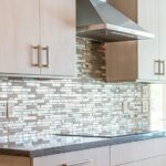
Use Statement Stone for Subtle Color Impact

I’ll guide you through selecting a statement stone that whispers rather than shouts, using color variation and light responsiveness to anchor your neutral kitchen without compromising its serene aesthetic. When you choose a stone like Blue Roma for your countertops and backsplash, you’re utilizing subtle saturation levels that allow natural light to enhance the material’s gentle hue while maintaining visual balance with warm wood and brass accents.
The key lies in recognizing that light-enhancing materials with restrained color depth create sophistication precisely because they function as quiet focal points, not dominant design statements.
Natural Stone Color Variation
How can you introduce color into a neutral kitchen without disrupting its serene foundation? Natural stone color variation offers the answer. I’ve found that neutral stone countertops and backsplashes introduce soft, subtle hues when paired with abundant natural light. Blue Roma exemplifies this approach; it reads as a quiet color infusion rather than a bold statement.
The inherent variation within the stone provides depth and texture, balancing old-world warmth with modern neutrals.
| Stone Type | Color Character | Light Interaction |
|---|---|---|
| Blue Roma | Restrained saturation | Shifts with natural light |
| Limestone | Warm undertones | Glows in afternoon sun |
| Granite | Speckled depth | Creates visual movement |
Restrained saturation keeps your neutral stone as a nuanced accent, allowing the kitchen’s classic beauty to flourish without visual competition.
Balancing Bold And Subtle
The real challenge in neutral kitchen design isn’t avoiding color; it’s introducing it without disrupting the serene foundation you’ve carefully built. Statement stone like Blue Roma accomplishes this balance perfectly. I introduce it through restrained applications, perhaps a backsplash or accent countertop section, where it reads as a designed moment rather than a dominant feature.
The key lies in keeping stone saturation controlled within your neutral tones palette. Natural light becomes essential here; it reveals the stone’s nuanced hues while preventing visual heaviness. I pair these statement pieces with warm materials: brass hardware and wood cabinetry that enhance textural depth while maintaining refinement.
This approach preserves calm elegance, merging old-world warmth with contemporary minimalism. The stone whispers rather than shouts, creating an aesthetic that feels carefully considered and collected.
Light-Enhancing Material Selection
When you’re designing a neutral kitchen, material selection becomes your primary tool for introducing light and subtle visual interest without compromising the calm foundation you’ve established. Natural stone surfaces, like Blue Roma on stone countertops and backsplashes, reflect abundant light throughout your space, brightening areas dominated by soft grays and whites. This approach introduces color contrast without overwhelming your neutral palette.
Rather than repeating statement stone across every surface, positioning it strategically as a focal material preserves elegance while creating visual depth. Pairing these selections with warm metallics like brass and natural wood enhances perceived warmth. The interplay between refined stone, light-reflecting surfaces, and complementary finishes achieves a sophisticated atmosphere that balances old-world charm with contemporary restraint, anchoring your timeless design.
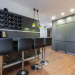
Furniture-Inspired Islands for Closed Storage and Seating
Why settle for a purely functional kitchen island when you can introduce a piece that functions as both storage solution and social anchor? Furniture-inspired islands reshape your neutral kitchen by combining elegance with practicality. I’ve found that this design approach works beautifully when you consider these elements:
- Closed cabinetry with ample drawers maximizes storage while maintaining visual clarity; no cluttered countertops disrupting your serene aesthetic.
- Counter overhang seating creates a natural gathering spot, encouraging conversation without demanding open shelving that interrupts sightlines.
- Warm materials like wood and brass accents paired with textured finishes create a timeless centerpiece that harmonizes with neutral palettes.
Large adjacent windows amplify lightness, reinforcing the impression of a refined living space rather than purely utilitarian kitchen. This integration positions your furniture-inspired island as the room’s sophisticated centerpiece.
Define Your Cooking Alcove and Workspace
How do you keep your cooking zone organized while maintaining your kitchen’s refined aesthetic? Defining a dedicated alcove or workspace creates a purposeful, elegant area within your neutral kitchen.
| Design Element | Function | Material | Visual Impact |
|---|---|---|---|
| Dark Soapstone Backsplash | Protection & Definition | Soapstone | Contrasts neutrals, adds depth |
| Walnut Shelving | Storage & Cohesion | Walnut | Ties to island, enhances unity |
| Integrated Ventilation | Air Quality | Seamless hood | Maintains uncluttered appearance |
| Full-Height Cabinetry | Concealed Storage | Custom millwork | Streamlined, sophisticated look |
An alcove creates visual boundaries for your range, pot filler, and counter space while separating the cooking zone from adjacent seating areas. This strategic separation reduces clutter and improves workflow.
Matching walnut shelving to your island strengthens visual unity throughout the space. Dark soapstone backsplashes differentiate the alcove or workspace from surrounding neutrals, adding architectural interest without disrupting your kitchen’s timeless elegance.
Solid Brass Hardware as Your Finishing Detail
I’ve discovered that solid brass hardware functions as both a practical element and a cohesive design detail in a neutral kitchen. It ties together cabinetry, lighting, and backsplashes while providing durability and a warm, unified glow. When you select unlacquered or satin brass finishes rather than plated alternatives, you invest in lasting quality that complements natural materials like marble, wood, and quartz without competing for visual attention.
The patina that develops on solid brass over time adds depth and personality to your kitchen. These jewelry-like accents are particularly effective in spaces that blend vintage-inspired and contemporary elements within a neutral palette, creating a cohesive appearance that feels intentional and well-designed.
The Power Of Hardware
Solid brass hardware functions as the jewelry of a neutral kitchen, changing cabinetry from serviceable to sophisticated through understated metallic detail. I’ve observed how this finishing element improves entire spaces when thoughtfully coordinated. Consider these applications:
- Pulls and knobs unified across cabinetry create visual cohesion while introducing warm metallic notes that anchor the neutral palette
- Brushed or lacquered finishes develop authentic patina over time, adding depth without requiring replacement
- Coordination with lighting fixtures and hinges extends the brass aesthetic throughout, reinforcing refined beauty
Natural materials like marble countertops and wood cabinetry amplify brass’s warmth, increasing sophistication. The hardware’s subtle gleam doesn’t overpower neutral schemes; rather, it enhances them.
When you’re designing a neutral kitchen that feels well-considered and complete, quality brass hardware delivers the refined finishing detail that distinguishes thoughtfully designed spaces from generic ones.
Brass Finishes And Cohesion
The gleam you’ve introduced through quality hardware now demands careful consideration of finish type, because different brass treatments create vastly different effects within your neutral palette. Satin brass or lightly lacquered finishes work exceptionally well alongside neutral cabinets, offering subtle contrast without overwhelming your space. Unlacquered brass develops a rich patina over time, adding depth that evolves naturally with use.
This maturation process grounds your kitchen within a unified material story. Limit heavy brass applications to key hardware and lighting elements: door pulls, cabinet handles, and pendant fixtures. This prevents visual saturation and allows brass finishes to function as jewelry for your cabinetry, complementing warm wood tones, white stone, and cool greige surfaces simultaneously. Balance remains necessary for a refined appearance.