Like a well-tailored suit that survives fashion cycles, your kitchen cabinet color choice can define your space for decades, or clash with tomorrow’s aesthetic. I’ve found that truly timeless colors share specific qualities: they work across lighting conditions, pair with evolving countertop trends, and resist the dated feel that trendy jewel tones develop within five years.
The difference between a cabinet color that endures and one that doesn’t hinges on understanding which palettes actually transcend style shifts, something we’ll explore next.
What Makes a Kitchen Cabinet Color Truly Timeless?

A timeless kitchen cabinet color is one that’ll look just as appealing two or three decades from now as it does today, and here’s what separates the enduring from the trendy: the color itself must work harmoniously with surrounding finishes like backsplashes, countertops, and hardware rather than competing for attention. White cabinets reign as the most versatile timeless choice, offering broad resale value and design flexibility. Neutral tones, including warm whites, creams, taupes, and greiges, provide classic presence without demanding focus.
Wood tones cycle through trends every five to ten years, making them less reliable long-term. The key distinction involves avoiding high-gloss, trend-driven finishes. Instead, prioritize durable materials and classic finishes that age gracefully, keeping your kitchen current through decades of style evolution.
Classic White and Creamy Whites: The Foundation of Versatility

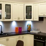
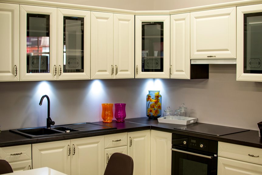
Now that we’ve established what separates timeless cabinet colors from fleeting trends, white and creamy white emerge as the most reliable foundation for a kitchen that’ll remain relevant for decades. Classic White provides a neutral palette that accommodates both light and dark countertops while pairing seamlessly with matte black fixtures. Creamy whites and warm whites offer softer alternatives, reducing harsh brightness while enhancing the welcoming atmosphere that strengthens resale potential.
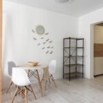
White cabinets create an open, spacious feel across traditional, transitional, and contemporary styles. They function as a versatile foundation supporting easy updates through hardware, lighting, or decorative accents without requiring full remodels.
Surrounding finishes like backsplashes significantly influence perception; warmer tones generally increase perceived timelessness, making them invaluable for building enduring design schemes.
Soft Grays and Greiges: Sophisticated Neutrality Without Compromise

I’ve moved beyond the stark contrast of classic whites, and I’m discovering that soft grays and greiges offer a sophisticated middle ground. They work across contemporary, transitional, and traditional spaces without the design rigidity that pure white demands.
Gray’s ability to shift between cool undertones and warm leaning variants means I can anchor a kitchen with Benjamin Moore’s Silvermist or Sherwin-Williams’ Urbane Bronze while maintaining flexibility for both stainless steel and brass hardware. Lighting conditions fundamentally alter how these neutrals read throughout the day, so I assess greige and gray samples in morning, afternoon, and artificial light before committing. This approach helps me verify the cabinet color harmonizes with my kitchen’s natural light exposure and doesn’t veer unexpectedly cool or warm.
Gray’s Versatility Across Styles
Why do designers repeatedly return to soft grays and greiges when seeking cabinet colors that transcend fleeting trends? I’ve found that these neutral palette choices offer remarkable versatility across design styles. Soft grays provide calm sophistication in open-concept kitchen cabinets, while greige—that gray-beige hybrid—anchors both transitional and contemporary spaces seamlessly.
What makes them timeless is their adaptability. They work equally well with warm brass hardware or cool stainless steel fixtures. Coastal, Scandinavian, and traditional aesthetics all benefit from these colors. Unlike stark pure gray, greige and soft gray avoid harshness, creating elegant backdrops that complement natural materials and varying light conditions.
This versatility means your kitchen cabinets remain relevant as design trends evolve, supporting diverse countertop materials and backsplash choices without competing for visual attention.
Greige: The Perfect Neutral Blend
When you’re seeking a cabinet color that bridges the gap between cool and warm palettes, greige delivers exactly what pure gray cannot: a sophisticated middle ground that doesn’t sacrifice either end of the spectrum. I find this neutral tones option avoids the starkness that sometimes plagues solid grays while harmonizing beautifully with natural light variations throughout your kitchen.
Greige functions as a versatile backdrop, anchoring both transitional and contemporary designs with equal ease. It adapts without disruption to sleek quartz countertops or industrial steel fixtures, maintaining its modern classic appeal regardless of surrounding materials.
This timeless choice balances bold accents without competing for attention, making it exceptionally buyer-friendly for long-term resale considerations. The color remains relevant across design cycles, offering enduring sophistication without trend dependence.
Lighting’s Impact On Tone
The color you select in showroom lighting won’t necessarily match what greets you in your kitchen at dawn, noon, or dusk. I’ve found that soft gray and greige shift considerably throughout the day. Morning light amplifies cooler undertones, while afternoon sun warms these neutrals considerably.
This quality makes them ideal for open-concept layouts where lighting conditions vary dramatically across zones. When choosing your neutral palette, observe samples under your kitchen’s actual lighting conditions at multiple times. Greige proves particularly resilient because it harmonizes with both warm and cool light shifts, maintaining its timeless appeal regardless of hour.
This adaptability keeps your cabinet color sophisticated and grounded, never appearing dated as seasons and daylight patterns change throughout the year.
Navy and Deep Blues: Bold Colors That Transcend Trends

How do you introduce drama to a kitchen without sacrificing longevity? Navy cabinets and deep blues deliver exactly this balance. These bold kitchen colors function as timeless contrast when paired thoughtfully; white uppers with navy lowers create a dramatic point that lasts across design cycles. Hale Navy by Benjamin Moore exemplifies this approach, with its slightly gray undertone preventing harshness while adding sophistication.
Deep blues work strategically. Apply them to islands or lower cabinets rather than all surfaces, preventing visual overwhelm. Pair navy cabinetry with complementary metals like brass or chrome, natural stone countertops, or light wood tones to enhance depth and richness.
This durable finishes combination keeps your bold kitchen color relevant across design evolutions, functioning almost like a neutral when applied with restraint and intention.
Sage Green and Warm Earth Tones: Nature-Inspired Longevity
Why do sage green cabinets remain relevant across design cycles while trendier greens fade? Sage green and olive green offer earthy tones that ground your kitchen in nature-inspired aesthetics without chasing fleeting trends. Unlike mint, emerald, or Kelly green, these muted hues provide durability in both visual appeal and versatility.
Sherwin Williams’ Olive Grove exemplifies this timeless kitchen approach, bridging historic and contemporary styles seamlessly. Sage green cabinets adapt effortlessly across door styles, from traditional raised panels to modern flat fronts, while pairing naturally with organic materials and varied countertops. The earthy tones create a calming ambiance that supports diverse hardware finishes and design directions. These green cabinets maintain balanced sophistication, keeping your kitchen investment relevant through multiple design cycles without feeling dated or requiring costly updates.
Natural Wood Tones: Texture and Warmth That Age Gracefully

I’m going to guide you through three critical dimensions of natural wood cabinetry that determine whether your kitchen investment reads timeless or trapped in a specific decade: the wood species and grain pattern you select, the stain color that either grounds or dates your design, and how light interacts with your cabinet surfaces to create visual balance.
Cathedral oak, cherry, and walnut varieties remain market-strong because their grain patterns, whether subtle or pronounced, integrate seamlessly with both bright white countertops and muted brass hardware. Heavily textured or ultra-glossy finishes from the 1990s and 2000s tend to signal their era immediately.
When you pair moderate grain visibility with warm mid-tone stains rather than extremes (neither pale honey nor near-black ebony), your cabinets age gracefully while reflecting kitchen light in ways that prevent them from visually overwhelming or disappearing into adjacent elements.
Grain Patterns and Wood Species
The foundation of any lasting kitchen lies in selecting wood species that deepen in character rather than fade into predictability. I’d recommend considering maple and white oak for lighter, airy spaces where grain subtlety matters. These woods maintain their classic appeal while keeping your kitchen feeling open and minimalist-friendly.
For dramatic impact, walnut and cherry deliver mid-century modern sophistication. Their darker tones create visual richness as grain patterns become increasingly pronounced over decades. Stained finishes on these species reveal depth that paint simply cannot achieve.
Avoid heavy oak, which trends quickly. Instead, focus on wood species with naturally refined grain patterns; ones that improve with age rather than show their years. Your cabinet investment will reward you with enhanced market desirability and enduring style through natural wood’s evolving character.
Stain Colors for Timelessness
How do you choose a stain color that’ll still feel current in fifteen years? The answer lies in embracing natural wood tones that age gracefully while maintaining timeless appeal.
| Wood Species | Stain Characteristics |
|---|---|
| White Oak | Light finish, airy aesthetic |
| Maple | Bright grain visibility, neutral backdrop |
| Walnut | Deep tone, sophisticated presence |
| Cherry | Warm undertones, dimensional richness |
Classic wood finishes emphasize grain visibility through matte stains, softening modern lines without era-specific trends. A timeless stain avoids trendy colors, instead selecting neutral bases that let your cabinet color longevity shine.
White oak and maple keep spaces feeling open, while walnut or cherry create understated luxury. The key is to choose matte wood finishes that reveal natural character over time, allowing hardware and accents to guide stylistic updates rather than the cabinets themselves.
Light Reflectance and Kitchen Balance
Natural wood cabinets absorb light differently than painted surfaces, and that distinction fundamentally shapes how your kitchen feels. Wood’s lower light reflectance value means darker stains like walnut or cherry draw in light, creating intimate spaces with drama and luxury. Lighter woods such as white oak and maple reflect more brightness, keeping kitchens airy and open.
Tonal balance matters significantly. Pairing wood cabinets with reflective countertops, such as polished marble or granite, compensates for absorbed light and prevents dimness. Conversely, matte backsplashes enhance the warmth wood naturally provides.
Your cabinet contrasts shouldn’t fight against this physics. Instead, align timeless finishes with complementary surfaces. This integrated approach preserves kitchen brightness without sacrificing the texture and sophistication natural wood tones deliver, keeping your design relevant across decades.
Testing Cabinet Colors in Your Space: Why Samples Matter
When you’re deciding between Benjamin Moore’s “Hale Navy” and Sherwin-Williams’ “Urbane Bronze,” seeing these colors on poster board in your actual kitchen, not on a paint chip at the store, is absolutely essential. I’ve learned that tester pots reveal how lighting shifts throughout the day affect your color samples, allowing you to see how they look across morning, afternoon, and evening hours.
| Testing Method | Location | Purpose |
|---|---|---|
| Poster board samples | Near windows | Observe natural light shifts |
| Cabinet samples | Adjacent countertops | Verify color harmony |
| Multiple samples | High-wipe zones | Assess durability and readability |
| Tester pots | Kitchen walls | Track real-world aging patterns |
| Style evaluation | Throughout space | Match desired kitchen feeling |
Real-world testing prevents costly surprises by revealing how finishes perform in actual usage areas. This is particularly important near sinks where moisture and wear demand durability verification.
Pairing Cabinets With Countertops and Kitchen Style
Your cabinet color choice becomes truly timeless only when you consider how it interacts with your countertop material and overall kitchen style. A beautiful navy cabinet loses its impact if paired with dark granite that creates visual chaos rather than contrast.
I’ll walk you through countertop material compatibility, pairing white or off-white cabinets with reflective quartz or marble, or choosing warm wood tones with textured stone. This helps you understand which combinations work well across decades.
Style coordination guidelines matter equally. Neutral backdrops like soft grays or greiges serve as versatile foundations whether your kitchen leans traditional, modern, or transitional. These colors allow you to update backsplash colors and hardware trends without redesigning your cabinet investment.
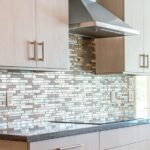
Countertop Material Compatibility
Because cabinetry consumes significant visual real estate in any kitchen, the countertop you pair it with fundamentally determines whether your design reads as timeless or trendy.
Countertop compatibility hinges on balancing visual weight and reflecting light. Here’s how to navigate material selection:
- White cabinets benefit from warm, textured surfaces such as butcher block or cream quartz that anchor brightness without sterility.
- Dark cabinet colors require lighter, reflective countertops like marble or high-gloss quartz to prevent visual heaviness.
- Natural wood tones harmonize with stone countertops that complement grain patterns, creating warm contrast.
Gray and greige cabinetry work with veined quartz or stone, enhancing depth while maintaining balance. Black accents demand light surfaces like white marble or light gray, preserving timeless contrast. Each pairing strategy helps your timeless kitchen resist dated aesthetics.
Style Coordination Guidelines
Now that you’ve selected cabinets and countertops that work together visually, the next step involves anchoring both within your overall kitchen style. This process determines whether your design feels unified or disconnected.
I recommend starting with a neutral backdrop of white, greige, or soft gray cabinetry. This foundation creates material harmony across varying countertop textures, whether quartz, marble, or granite, while maintaining flexibility for future updates. The real coordination happens when you introduce contrast strategically. Bold accent colors on islands or lower cabinets prevent a neutral palette from feeling bland.
Your backsplash becomes the updateable element, allowing personality without compromising the cabinet color’s longevity. This layered approach keeps your kitchen both visually unified and perpetually fresh.
Finishes That Protect Cabinet Color

How much thought do you give to cabinet finishes beyond color selection? I’ve found that the right finish makes your cabinet investment a lasting design choice rather than a temporary trend.
The finish you select directly impacts your kitchen’s longevity and visual appeal. Consider these protective options:
- Semi-gloss finishes – offer superior moisture resistance and easy cleaning, making them ideal for kitchen environments where durability matters most
- Satin finishes – provide subtle sheen without excess shine, delivering timeless aesthetics that age gracefully as styles evolve
- Brushed nickel and matte black – contribute visual interest while maintaining versatility across design shifts
Semi-gloss and satin finishes deliver exceptional durability by resisting moisture and stains. These timeless finishes remain classic, not overly showy.
Coordinating your chosen finish with countertops and backsplashes creates a cohesive design that reduces the need for frequent updates. When finishes align with surrounding materials, your kitchen stays relevant through seasonal trends.
Layering Timeless Bases With Accents

Once you’ve locked in a durable finish, the real design strategy unfolds through layering. Build timeless bases using white cabinets or neutral backdrops in soft taupe and gray, then introduce layered accents through backsplashes, hardware, and countertops. This approach lets you refresh your kitchen without full renovation costs.
Pairing a semi-gloss finish on your cabinetry with colored backsplashes such as navy, sage, or muted earth tones adds personality while preserving that timeless foundation. A contrasting wood island or natural wood countertop introduces richness and depth against cool neutral tones.
The beauty lies in using removable accents: trending lighting, hardware, and textiles shift seasonally or cyclically. Your core cabinet color remains stable for long-term resilience while these accessories evolve with design preferences.